Udemy
Helping users make decisions and supporting diverse learning environments


Project overview
With over 210,000 online courses, Udemy is the world’s largest learning platform that provides a diverse range of online courses. As a user of Udemy myself, I have noticed several difficulties in the process of selecting the courses for me. In addition, despite having a global user base, the app’s UI lacked support for users who do not speak the language of their instructors. Through user research and usability evaluation our team sought ways to resolves these issues.
Yeojeong Lim
Current Problems


Key features
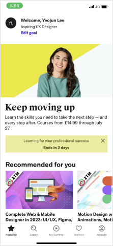
Clear and user-friendly main page
- A search bar was added at the top to help users quickly find the courses they need.
- The main page was decluttered to present the content clearly and more user friendly.

Prominent and clear filter indication

Live transcript to help learners around the world, in every situation

Discover
Competitor analysis


User Survey
App store & Play store Reviews
Define
Affinity map
We collated Udemy users’ accounts from the app store reviews and survey answers and organised them into five main themes.
Empathy map
By creating an empathy map, we synthesised what we learned from engaging with Udemy users. In this phase we reexamined all facets of people’s experiences using Udemy. Particularly by visualising users’ emotional responses and how they were resolving their frustrations, we were able to better identify pain points.
Prioritisation
We synthesised our research and insights and worked out possible solutions. These ideas were sorted into four categories in the 2x2 prioritisation matrix.
- Helping users search and filter the vast number of courses on Udemy
- Making courses more accessible for users with different backgrounds(language) and physical abilities and environment.
Develop
Crazy 8's Sketch
We sketched out designs before moving on to wireframes and high fidelity designs, to save time and resource in the latter stages of the design process.

.gif)
Wireframes
We developed low~mid-fidelity wireframes to lay out content and visualise functionality and user flow. In this stage, we focussed on whether the interface and hierarchy of different elements made logical sense for the users.


Deliver
High fidelity designs


Clearer content information
We added a search bar at the top of the home screen to better accommodate user behaviour. We also drafted a more personalised default page taking out less relevant lists and items. Sorting and filter features are also made prominent in the search results page.


Maximising existing features
- To help users in making a purchase decision, we re-organised the visual hierarchy, decluttered the page and made it possible to sort student reviews to assist users in making purchase decisions.
- We added a ‘collection’ feature so that users can categorise items in their wishlist.


Enhanced accessibility
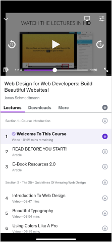
- A live transcript can help users from different language backgrounds and in different using spaces.
- Diversified note-taking modes also support users listening to lectures in various physical settings.

- The option to customise closed captions can assist users with different visual abilities and benefit users using larger devices
Usability test

Content creator
Developer
Cybersecurity
Evaluation
- Visualising information about users, especially information that I think I know well is crucial in grasping pain points and truly empathising with the user.
- It was eye-opening to see the curb-cut effect of a single feature; adding a live-transcript for the lecture video not only helped users with different language backgrounds but also helped users who felt they were wasting their time rewinding the video for various reasons.


.png)


