Linktree
Concise, straightforward information delivery while maintaining brand identity

Project overview
Linktree simplifies link-sharing on social media by consolidating multiple links into a single shareable link. While working as a social media manager at an art gallery, I utilized Linktree to drive traffic to the gallery’s website. Despite the tool's user-friendliness, I found the landing page information unclear. This prompted me to redesign Linktree’s homepage for a more concise and understandable user experience, focusing on delivering clear information while maintaining the brand's aesthetic identity.
Current Problems


Grid system
Desktop
12 columns | Margin 360px | Gutter 20px

Tablet
8 columns | Margin 24px | Gutter 20px

Mobile
4 columns | Margin px | Gutter 20

Style guide

Solution


Catchy, impactful hero section
Page visitors are welcomed by a compelling heading and concise product information.


Concise product information
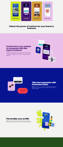
Information on the product features, benefits spread and repeated across the page was categorised and collated into two main topics and several sub-topics.

Organised card layout
The card format not only organises information but also incorporates Linktree's vibrant colour palette without overwhelming the users.

Coherent CTA button styles and sizes
The sign-up buttons across the page were redesigned for greater coherence by employing consistent labels that encourage user engagement without imparting a sense of coercion.


Easy to navigate, simple subscription plans
Users can now view and compare subscription price plans and features directly on the landing page, eliminating the need to navigate through a different page.
Responsive web
Desktop

Tablet

Mobile


.png)


